![]()
![]()
![]()
![]()
|
|
|
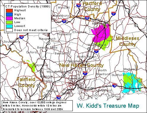
Sample Treasure MapFor this example we are using a request that a client left on our web site. "My company likes locations that have at least 10,000 college graduates within 5 miles. The forecast for the extended trade area of 10 miles must be for an increase in the number of households over the next 5 years. Please rank by population density. I'm looking anywhere in New Haven County, Connecticut. Thanks, Captain W. Kidd."
What does this map tell Captain Kidd?By looking at this map, the Captain can quickly see that the colored locations satisfy both criteria and the white areas don't satisfy both criteria. These colored areas, regardless of the population density rank have been pre-screened to meet the criteria. Therefore, If the Captain can find a suitable available property in any of the colored areas, that property will have at least 10,000 college graduates within 5 miles and the number of households within 10 miles will be forecasted to increase. The Captain wanted the locations that meet both criteria ranked because he finds that he has greater sale potential in areas of higher population density. This is how he prioritizes his search. He starts looking for site in areas with greater population density then shifts to areas with lower population densities. The ranking is only a guide to him - you may have a different ranking system like the number of competitors within 10 miles. The Captain doesn't care about the numbers that go into the rankings. After he locates a suitable property, the Captain will order a 5-7-10 mile ring study with the property at the center of the rings to include in the site package. For you technicians -- The colored areas in this study are ranked by the range in population densities from a convenient geographic area - in this case, the State of Connecticut. The actual numbers behind the rankings are available. For example, the median population density in the state can be provided if desired but it is of dubious relevance. None of the areas of Connecticut with the highest or high population densities are located in the colored areas. In this example, the Captain didn't intend to use the numbers behind the color and was only interested in knowing which of the pre-qualified areas were better or worse. Remember, he will be getting ring studies for specific properties after he identifies them. Want to see a large format Map? It is about 1MB in Adobe Acrobat PDF format and suitable for a war room map. Click Here. For additional samples and advanced applications for retail and healthcare uses visit our Map Gallery Order yours today. Order Form |
Questions or problems regarding this web site should be directed to Christopher Miner 860-443-8405.
|